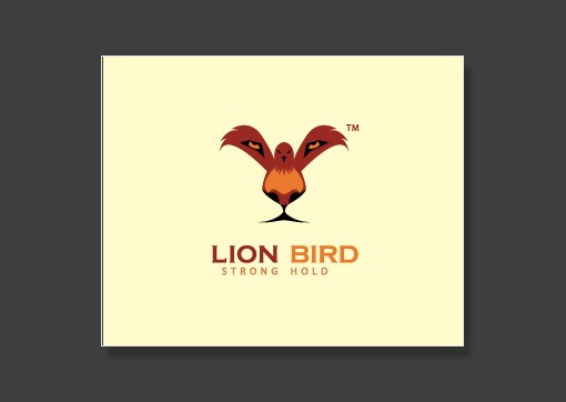
We have all seen examples of logo design that convey more than one meaning within the same limited space. Lion Bird is one such logo that forms two images simultaneously: the foreground is a dark shaded bird with its wings spread. Take a look at the background, and the bird becomes the lion’s eyes, nose, and face while the rest of the images fades perfectly to complete the entire head of a lion.

This logo design is one of the few examples of clever use of negative space out there. With a light colored background, this logo relies on a pure black logo that dictates elegance and power.

Another contender for the double entendre category, this logo design uses a simple abstract shape of a tent. The twist lies in the unique coloring of the tent, which gives it the appearance of an upright pencil.
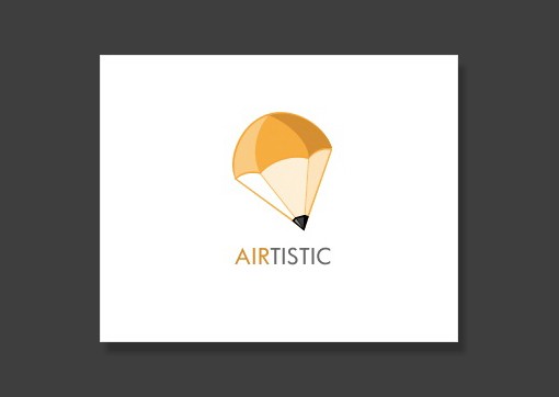
A symbol of free thinking and creativity, the pencil conveys a sense of unconstrained expression and perfectly represents all types of design work. This logo turns a parachute shape into an upside down pencil through the clever use of color and shading.

This logo design incorporates the clever use of the small case letter “g” to form the face of a giraffe. Complete with horns and ears to the side, it creates a distinctly recognizable logo.

Have you heard about the bird? Has Peter told you about the bird? While you look that up, this is a clever example of using a shape as a letter. The logo utilizes the silhouette of a bird flying away as the letter B, followed by the remaining three letters of the logo.

An example of nice, clean design, this logo relies on a uniquely shaped text and a shade of red that pops. Recognizable from a good distance, and distinct enough not to be mixed up with similar logos, this is one that truly stands out.
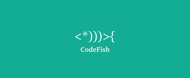
This logo design relies on a clever use of characters including brackets and an asterisk to form the shape of a fish. This is a really fitting logo as it relies upon characters that are used in coding and conveys a subtle hint at the ingenuity and creativity of the team – both essential for success in software development and coding.

Now this is a great example of a play on words used to the maximum advantage. By incorporating a real maze in the middle of the word, “Amazing”, this logo scores on all the right criteria. It is simple and neat, uses a uniform two color shade, and adds a visually attractive element of creativity.
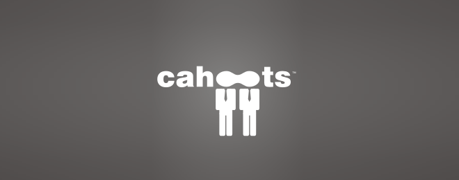
This logo also uses a similar play on words technique for its design. One unique thing about this logo is that it manages to spell out the name “Cahoots” and adds a graphic logo without distorting the word or the shape of two persons too much. This may be one of the few logos out there that successfully incorporates both letters and shapes with ingenious clarity.

This logo design counts on a cleverly placed shape to go along with the name. The shape took quite a bit of thinking to come up with from what it seems. Showing two matches together with flames lit conveys a secondary meaning to the logo that would be otherwise unexplained.

Simple and representative of the new minimalist trends sweeping the web, the Uptown logo relies on using abstract shapes. It shows 5 arrows pointing upwards that can just as well be seen as houses. Another unique feature of this logo is the shading on the shape which gets lighter with height.

Relying on one of the nuances of typing, this logo uses the misspelled word “bckspace” followed by a writing prompt. The logo uses a light shade on a dark brown background for a clean, modern look that remains aesthetically appealing.
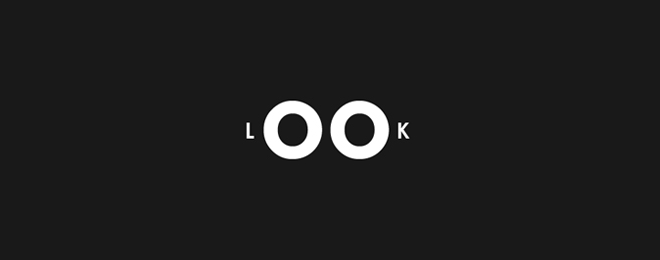 Another logo design that stands out for integrating a shape with letters is the LOOK logo. Perhaps ‘O’s are the easiest letter around to replace with a shape, and the designer for this logo has sure taken advantage of that. The logo incorporates two large ‘O’s that can double as eyes. This is achieved through the clever reverse coloring effect given to the logo by using white font against an all black background.
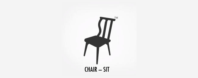 Furniture design requires a good deal of creativity. We can say for sure that if the furniture makers behind this company are as talented as the logo designer, we would be their most loyal customers. The logo is based around a chair facing the viewer. The back of the chair is cleverly used to incorporate the word “SIT” and is only evident when you look closer for a second glance.Further ReadingIf you’d like to see more interesting logo designs, you will find more information at the following places:http://webneel.com/best-logo-design
http://designshack.net/articles/graphics/50-fantastically-clever-logos/