Vector vs. Raster for Logo Design
May 16, 2016
Vector vs. Raster for Logo Design

Orc_-_Raster_vs_Vector_comparison

Are you on the verge of starting your own business? Every business needs good management, good business ideas and efficient staff to succeed but that are not the only secret ingredients of a successful business. For being able to run a prospering and booming business, you also need to ensure your business has a good logo design as it depicts the company’s main aim and targets which help to attract a large number of customers.

Vector Graphics

Vector graphics are comprised of extremely thin lines and curves called as paths.  Each path is formed by connecting a specific point or node location on x and y axes of a vector graph. All vector graphics are created using a special computer software which represents the graphics as an intricate wireframe, in which each path/line consists of a well defined node location, node position, length and curves.

Vector logos use very formulaic, systematic approach to the drawing and can be sized and resized repeatedly without losing their resolution or looking pixilated (as with raster images, which we will get into later).

Indeed, it is easy to identify a logo made from a vector graphic, simply by looking at the edges. Vector logos are always smooth, regardless of their size. They are not much different from a text – a text retains its look regardless of whether you increase or increase its font size. In fact, text is a vector graphic.

Typically, a vector logo file is of a relatively small file size, between 300kb and 1mb, regardless of the size to which the logo is scaled up.

Vector Graphics

Vector graphics find a very popular use in the creation of logos and insignia. They are also used in high resolution, high quality clip art. Most text types and fonts are created as vector images and can be resized effortlessly without losing their attributes. But yes, if logos are what you are after, choosing to go with the vector format makes a lot of sense.

Raster Graphics

Raster graphics are also called as bitmap images and are made of tens of millions of tiny squares called pixels. It is easy to identify a raster logo by zooming in and looking at it closely. You will be able to notice the square outline of each pixel in the logo. The edges are clearly visible because of the color contrasts relative to the rest of the image.

Where are Raster Graphics Used?

Most of the images that you see on a website are raster images. They are widely used in digital projects, not so much in printed reproductions used physical books, magazines and newspapers. Raster images are saved as low resolution graphics, which makes them unsuitable for use in logos, generally.

ff1e0fd404be6180c0abf7a3ad4583ff7209653a

Vector vs. Raster - Which is Better for Logo Design and Why?

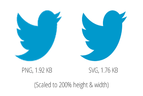
There is no question that vector images are the best option when it comes to creating logos. Vector images are far more flexible when it comes to making changes. You can resize and rescale them as you wish. This is an important consideration when you are creating a logo. Your logo won’t just exist in the digital form; it will be reproduced to be used as a banner or on merchandise as well. Vector images are very easy to reproduce in a printed form, so they give you more options with respect to the logo design.

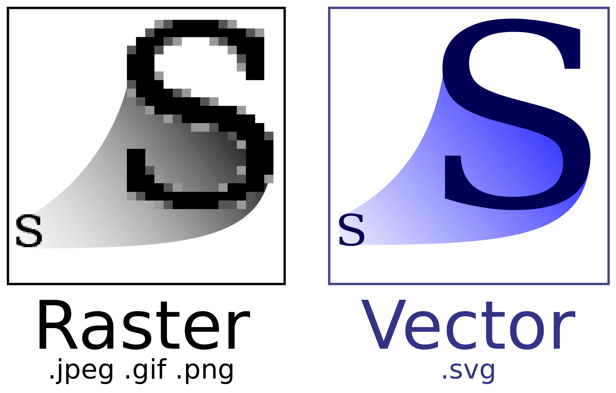
For example, consider the close-up of the logo done here in the vector format. You can clearly see the points and lines that make the logo what it is. These points and lines can be scaled and sized as you wish without any loss of quality or sharpness of the design.

56f3a9647e38df4e6b614dba5a2e0dc528997b1b

Raster images are NOT a great option when you are creating or working with logos, especially if the logo is text based. In some cases, when the logo is image-based rather than text-based, you can go with the raster format without any significant drop in quality, but generally, logos are saved as vector files. You can save the copies of the logs as raster images to be used later for digital projects.

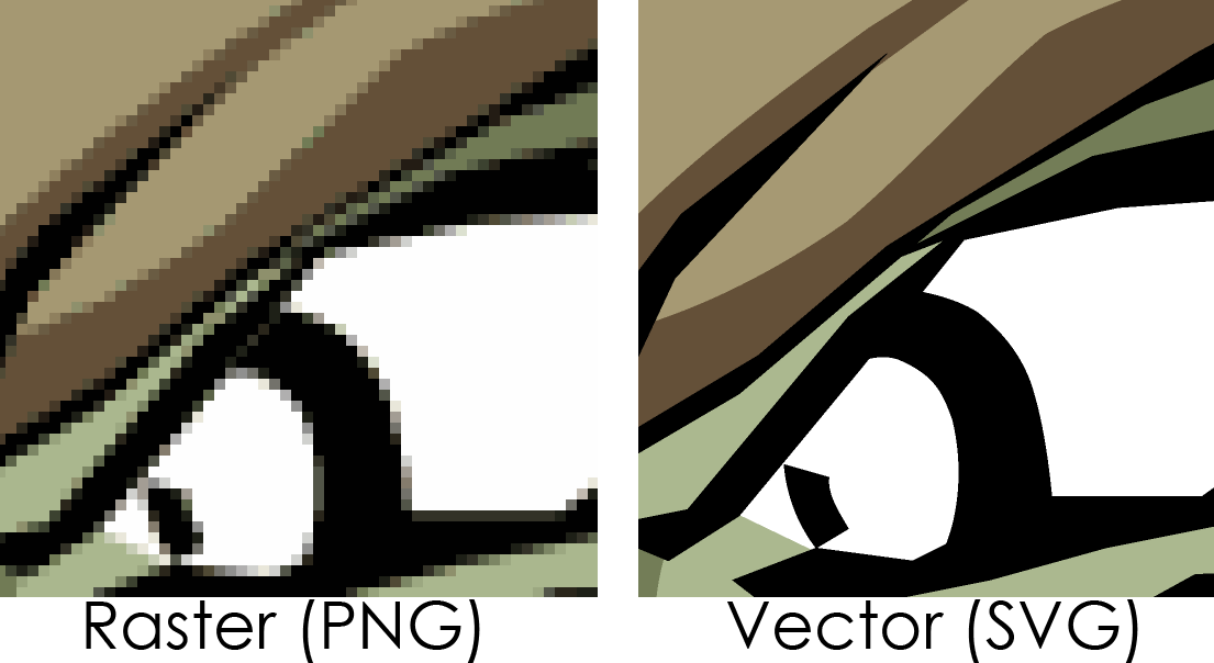
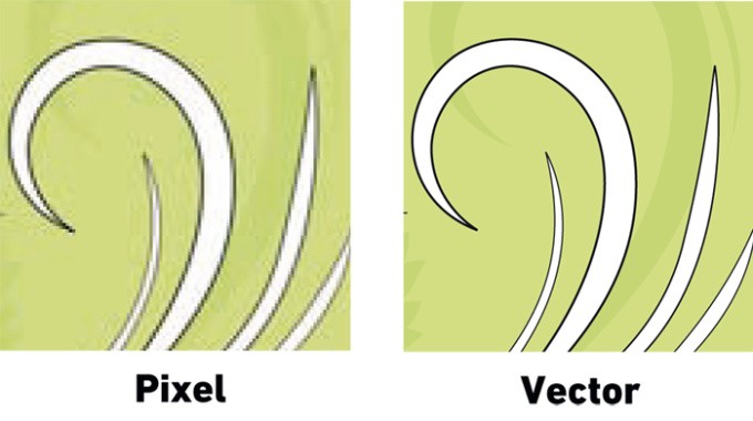
Consider the close-up of the logo designed in the raster format. Here you can clearly notice the pixilated edges of the logo. The edges contain shades of gray to create an optical illusion of a curved line. This is fine as long as the logo is kept small, but once you scale it up and make it larger, the pixelation becomes very obvious and it is hard to miss the tiny squares. For this reason raster images aren’t used for logo design, they just don’t make professional logos and certainly look very odd when reproduced on merchandise or on a printed media.

Bitmap_VS_SVG.svg

Vector Logos: Pros and Cons
Pros

Smaller File Size – Vector logos are of a smaller file size than their raster counterparts. That’s because they are identified by mathematical descriptions and not by individual pixels, so they occupy less space and make efficient use of file size.

Easily Scalable – Vector files can be scaled up or down as you like without affecting the logo quality. That’s because they use a mathematical description to create a consistent shape regardless of the size.  With vector, your original design does not need to be set in a specific size.  You have the ability to output that design as a raster image to any size/resolution desired.  This is not the case with raster logos, where the colors of all pixels to be added have to be specified when scaling up.   Scaling up with raster images will compromise the quality of that image and create a pixelated effect

Easy to Edit – Vector logos are easy to edit using software such as Adobe Illustrator. You can modify each of the individual elements on them without them affecting the other objects in the design.

Awesome Special Effects – Vector logos are simple by definition. So using special effects or styling effects such as drop shadows with them is slightly more difficult to accomplish. But with latest software, vector logos can accomplish pretty much any type of special effects that can be achieved with raster images.

Excellent Choice for Printing Media – Vector format is now a standard in graphic design industry.  Your cereal box was likely designed using a vector type program.  From logo design to product labels, vectors format allows for easy design manipulation with professional results. Output files can be set to any resolution and will always come sharp looking.   Many print shops will ask for vector files in order to get the best printing result.

Cons

Compatibility – Vector logos have an issue with compatibility. They are not compatible with all programs, apart from the one that you create them on. So a vector logo created in Adobe Illustrator may not be so easy to use with other vector software programs, for example Inkscape and vise versa.

 Still not as detailed – Vector logos still lack effects detailing that is available with software for raster images.  Technology has improved over the years, however it is more challenging to capture complex special effects in a vector program as opposed to raster program such as Adobe Photoshop.

Complexity – A simple vector file is much easier to create and manipulate.  However, even simple changes in a complex design can become challenging and require more time and skill to overcome.

Vector Logos: Pros and Cons
Pros

Much More Detailed – You can create a highly detailed logo design with raster images based on the number of dpi or “dots per inch” The higher the dpi, subtler are the details used in the logo design.

 Very Precise Editing – With raster logos, you can modify the color information on each of the individual pixels, one by one. If such precision is what you are looking for, then you should go with raster images for your logo design.  Adobe Photoshop can also be used to create vector files.  Some complex illustrations may require the use of both raster and vector programs.

Cons

Looks Pixelated or Grainy When Enlarged– Raster logos become blurry when you enlarge them. That’s because there are only a limited number of pixels in the raster images, so it’s hard for your computer to guess the colors of the missing pixels when you enlarge the image or the logo.

Has Bigger File Size – Raster logos have larger file sizes than vector logos, as the software has to render each of the pixels present in them. This could be a problem if the storage space on the server is limited.

Lack of Sharpness in Text Appearance – A raster software program such as Adobe Photoshop can be used to capture some very amazing effects with images.  Unfortunately,  Photoshop lacks the ability to deliver sharp text appearance that can be easily achieved using a  vector software program such as Adobe Illustrator.

The Bottom Line - Vector vs. Raster for Logo Design

So if you could use only one format, should you go with raster or vector? It should be clear from this article that when going for a logo design, you are much better off going with a vector logo.

This gives you far more flexibility as you can scale the logos up or down as you like. Raster logos on the other hand, are preferred for web or digital applications.

One of the issues with vector logos is that you may not have the software needed to view the vector file such as Adobe Illustrator and Adobe InDesign. It is not easy to use vector logos on Microsoft Word, for example.

Even if you use vector logos, you will need to save them in a raster format to be used on the web later. So the best approach is to get vector logos and then to save them in the raster format as well, in addition to the vector format, to be used on the Web later.