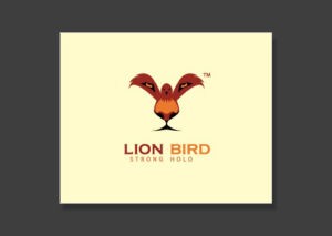
We have all seen examples of logo design that convey more than one meaning within the same limited space. Lion Bird is one such logo that forms two images simultaneously: the foreground is a dark shaded bird with its wings spread. Take a look at the background, and the bird becomes the lion’s eyes, nose, and face while the rest of the images fades perfectly to complete the entire head of a lion.
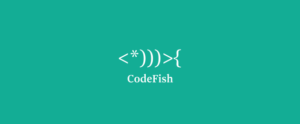
This logo design relies on a clever use of characters including brackets and an asterisk to form the shape of a fish. This is a really fitting logo as it relies upon characters that are used in coding and conveys a subtle hint at the ingenuity and creativity of the team – both essential for success in software development and coding.
This logo also uses a similar play on words technique for its design. One unique thing about this logo is that it manages to spell out the name “Cahoots” and adds a graphic logo without distorting the word or the shape of two persons too much. This may be one of the few logos out there that successfully incorporates both letters and shapes with ingenious clarity.
 Another logo design that stands out for integrating a shape with letters is the LOOK logo. Perhaps ‘O’s are the easiest letter around to replace with a shape, and the designer for this logo has sure taken advantage of that. The logo incorporates two large ‘O’s that can double as eyes. This is achieved through the clever reverse coloring effect given to the logo by using white font against an all black background.
  Furniture design requires a good deal of creativity. We can say for sure that if the furniture makers behind this company are as talented as the logo designer, we would be their most loyal customers. The logo is based around a chair facing the viewer. The back of the chair is cleverly used to incorporate the word “SIT” and is only evident when you look closer for a second glance.
Further Reading
If you’d like to see more interesting logo designs, you will find more information at the following places:
http://webneel.com/best-logo-design
Furniture design requires a good deal of creativity. We can say for sure that if the furniture makers behind this company are as talented as the logo designer, we would be their most loyal customers. The logo is based around a chair facing the viewer. The back of the chair is cleverly used to incorporate the word “SIT” and is only evident when you look closer for a second glance.
Further Reading
If you’d like to see more interesting logo designs, you will find more information at the following places:
http://webneel.com/best-logo-designhttp://designshack.net/articles/graphics/50-fantastically-clever-logos/

